
DEADSTOCK
ART DIRECTION / BRAND IDENTITY / UI DESIGN / PACKAGING / SOCIAL MEDIA

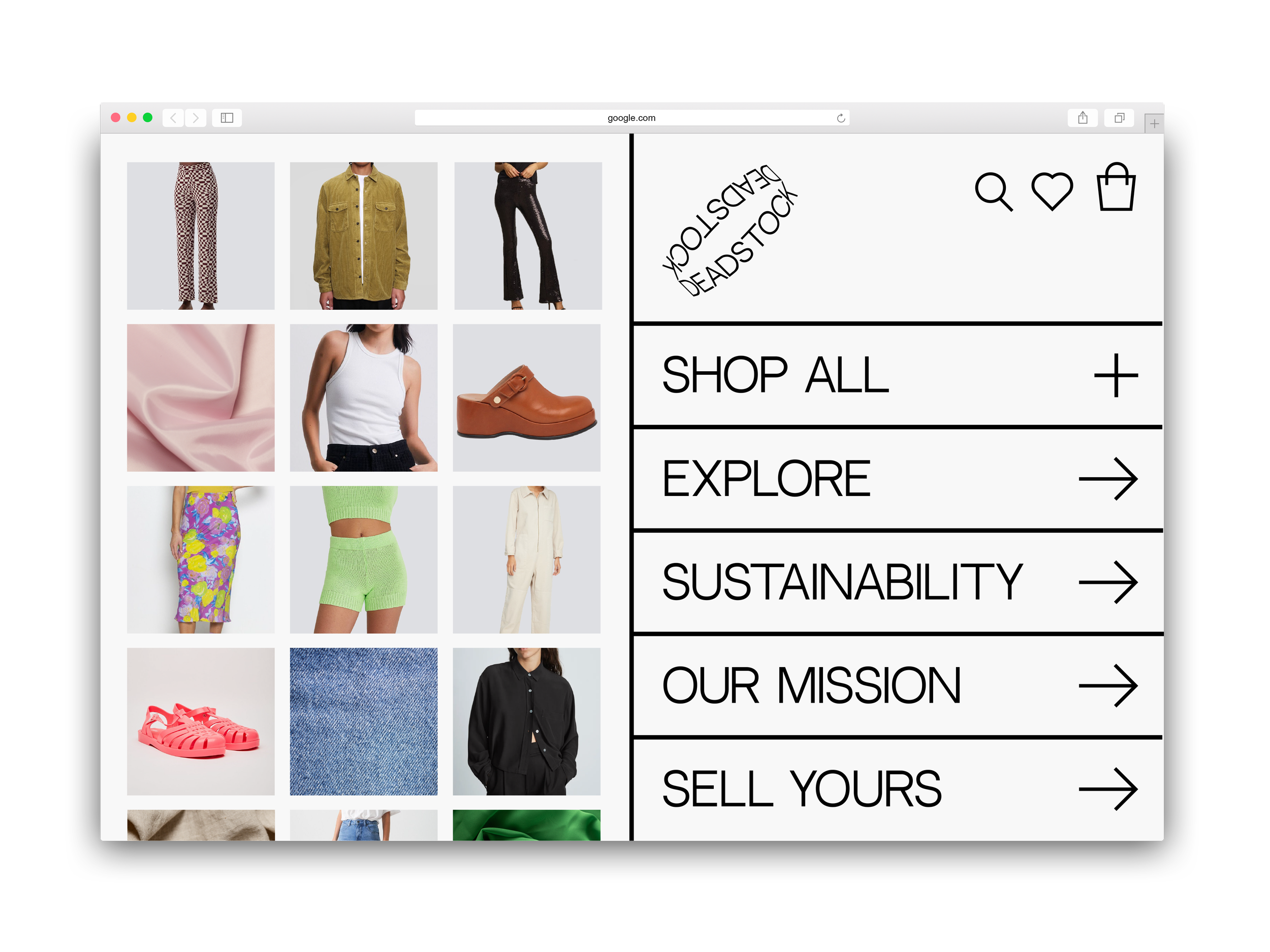
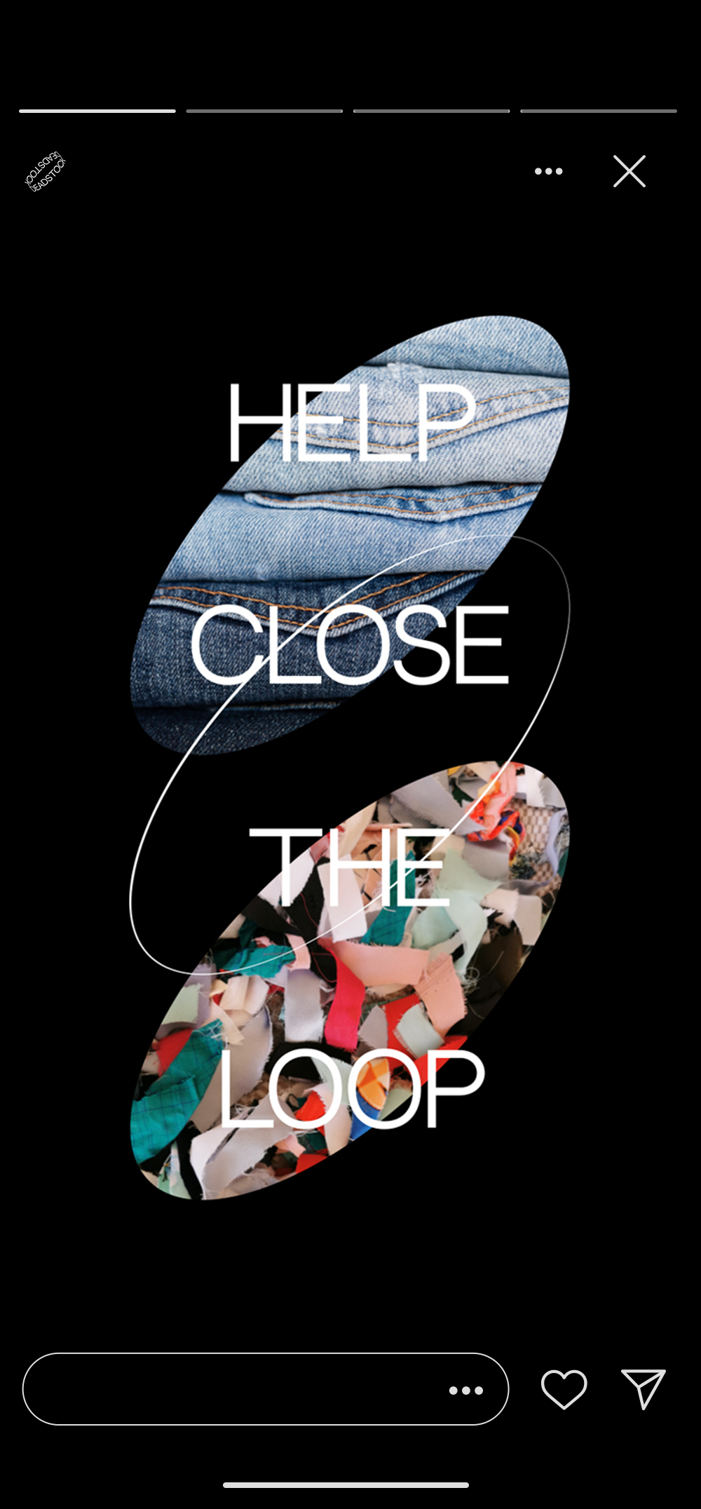
Deadstock is a circular fashion platform designed to close the loop on excess inventory. By connecting brands and consumers with unsold clothing and textiles, the platform gives existing materials another life through resale, redistribution, and reuse—turning fashion waste back into a resource.
CHALLENGE: Fashion’s cycle of constant production creates enormous amounts of excess inventory and textile waste. Deadstock challenges the idea that newness requires something newly produced, asking instead: what if what already exists could become desirable again? The challenge was to make circular consumption feel accessible and culturally relevant without relying on the predictable visual language of sustainability.
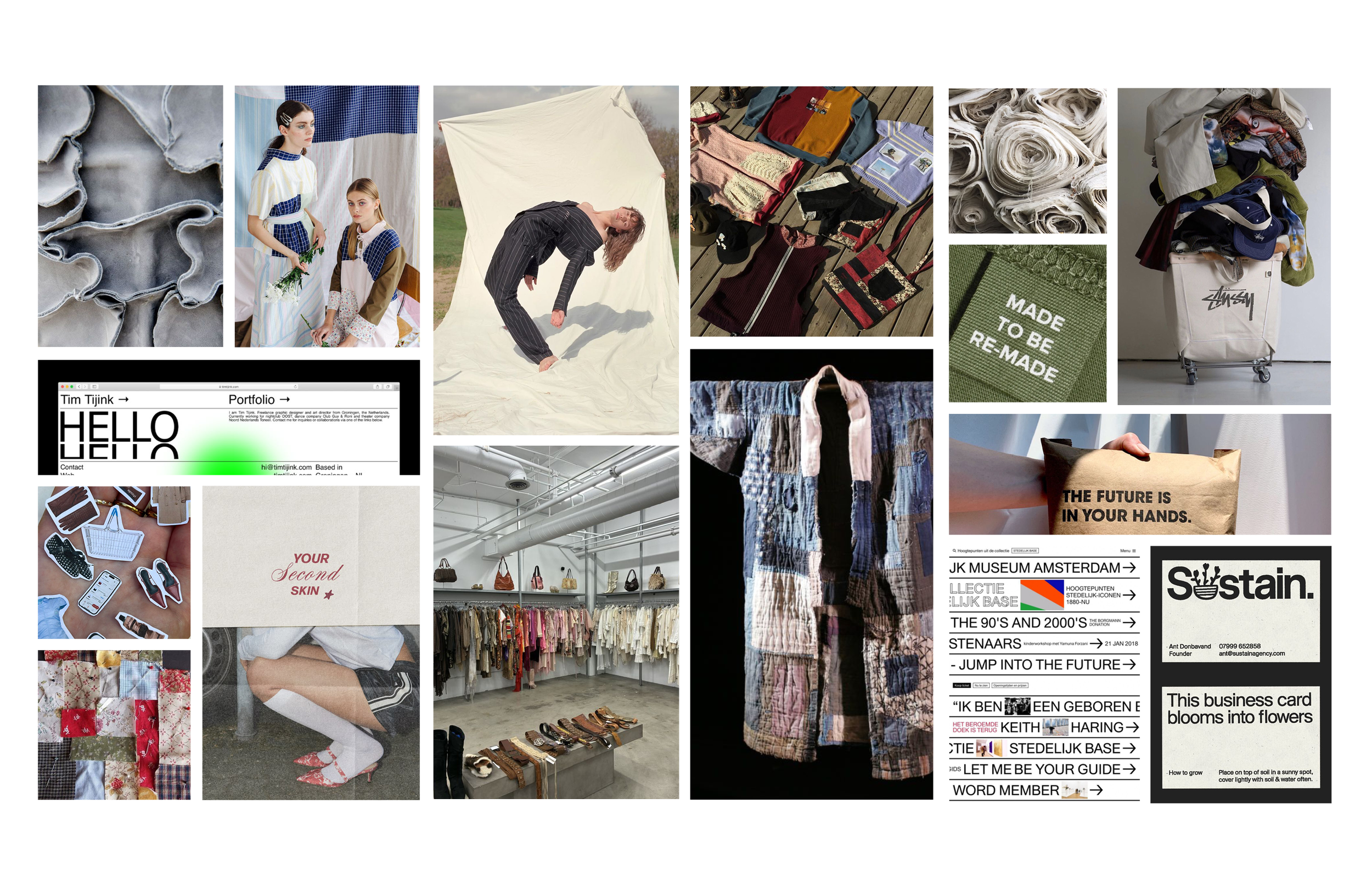
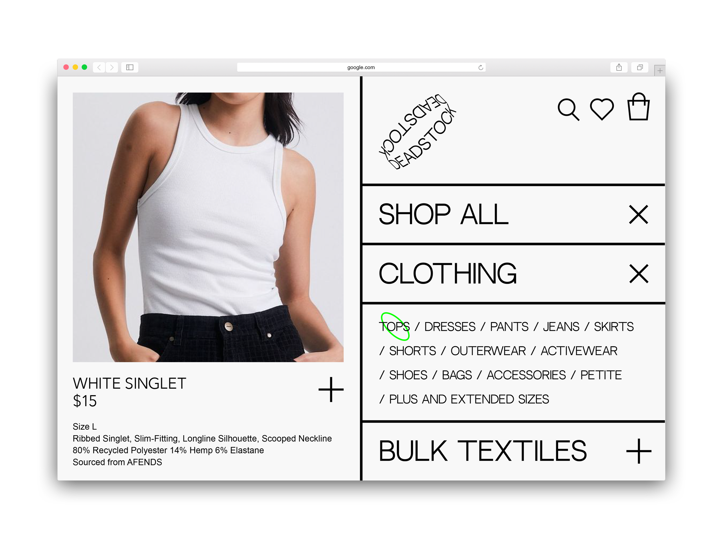
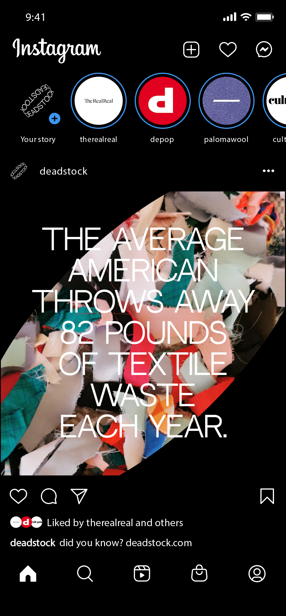
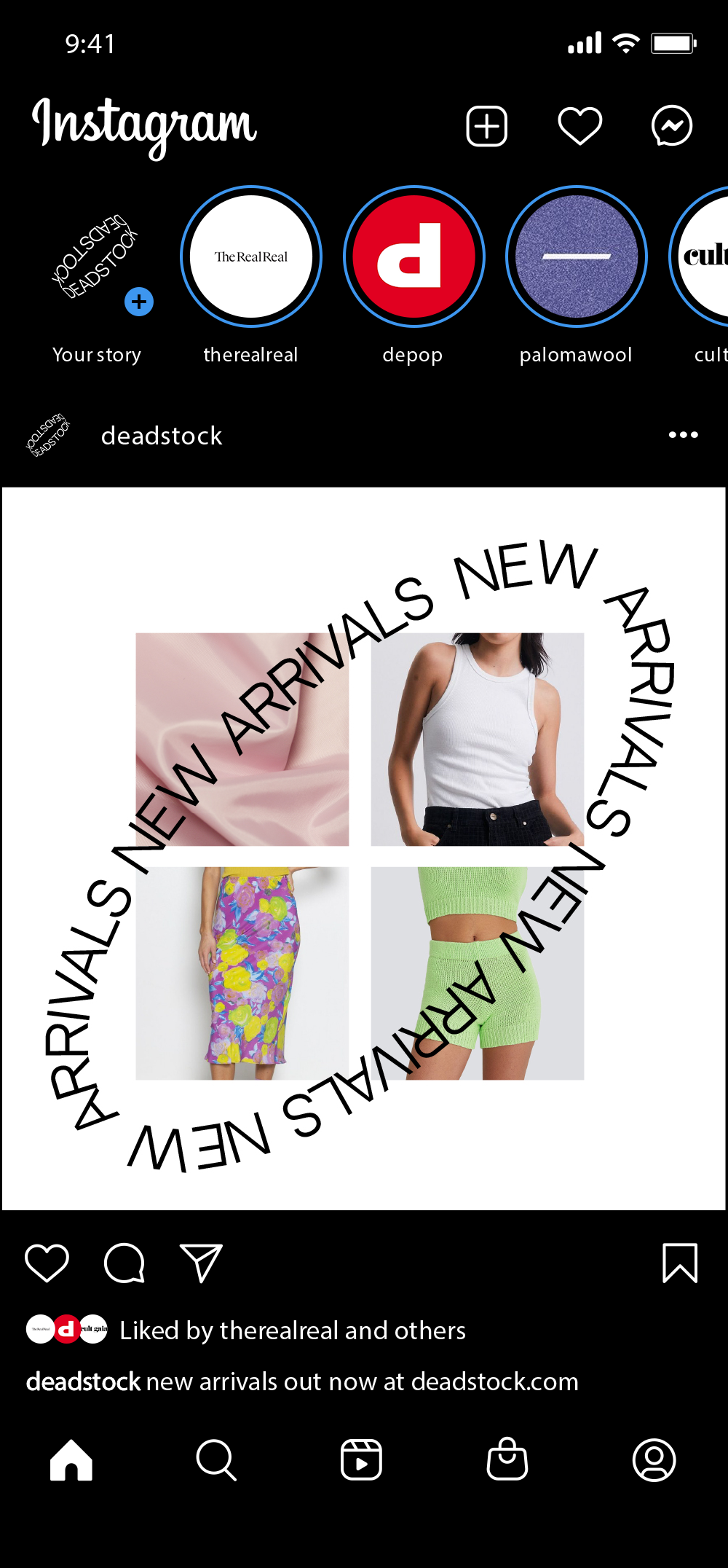
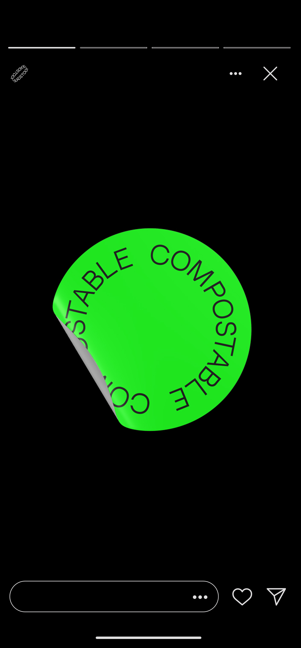
APPROACH: Deadstock reframes circular fashion through the visual language of contemporary retail. A bold, editorial identity pairs clean digital systems with disruptive typography, tactile imagery, and unexpected moments of color. Sustainability is embedded into the brand rather than treated as its aesthetic, allowing Deadstock to feel fashion-first while remaining purpose-driven.

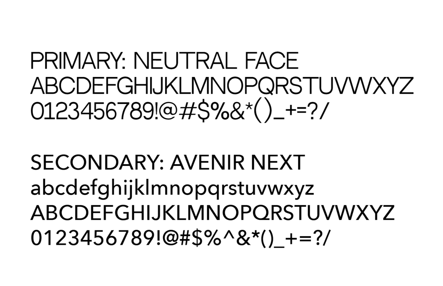
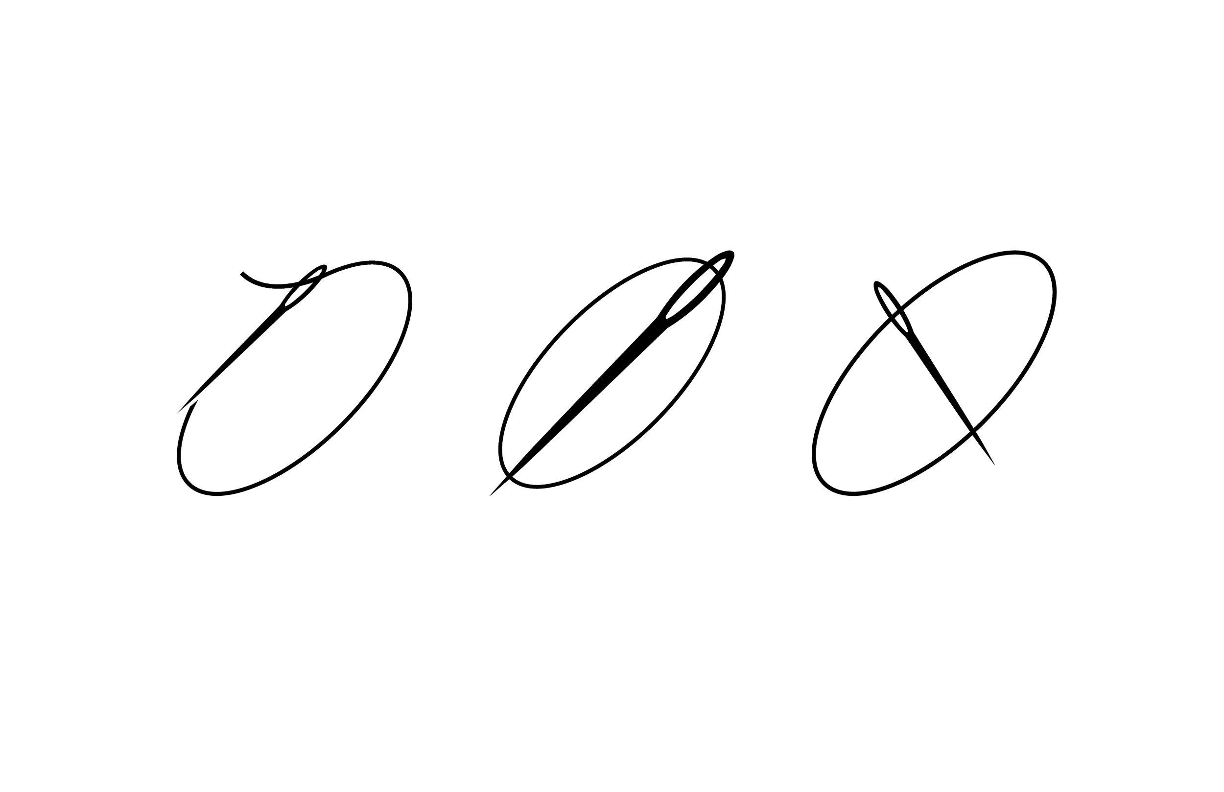
ALTERNATE LOGO ITERATIONS
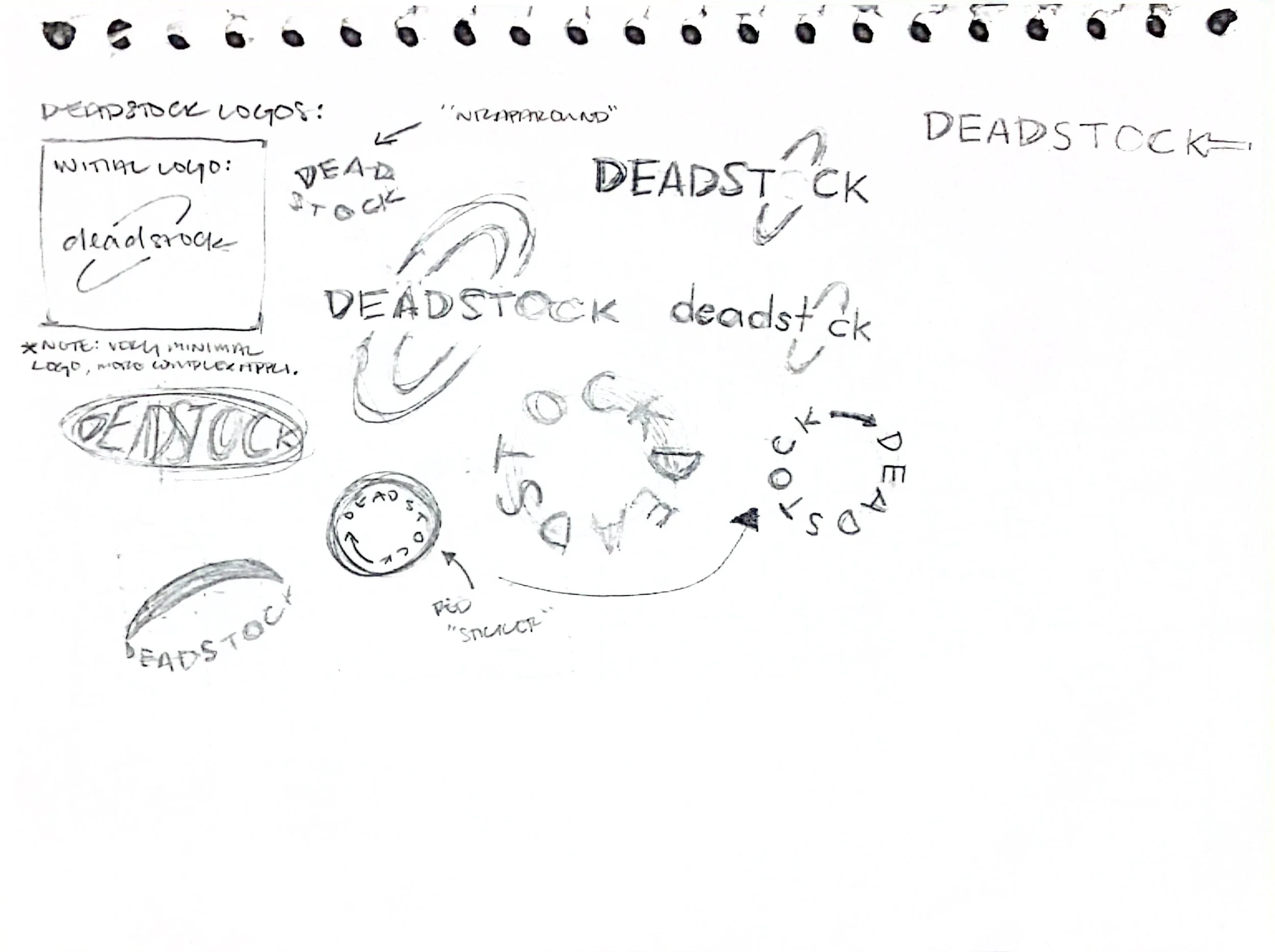
EARLY LOGO ITERATIONS
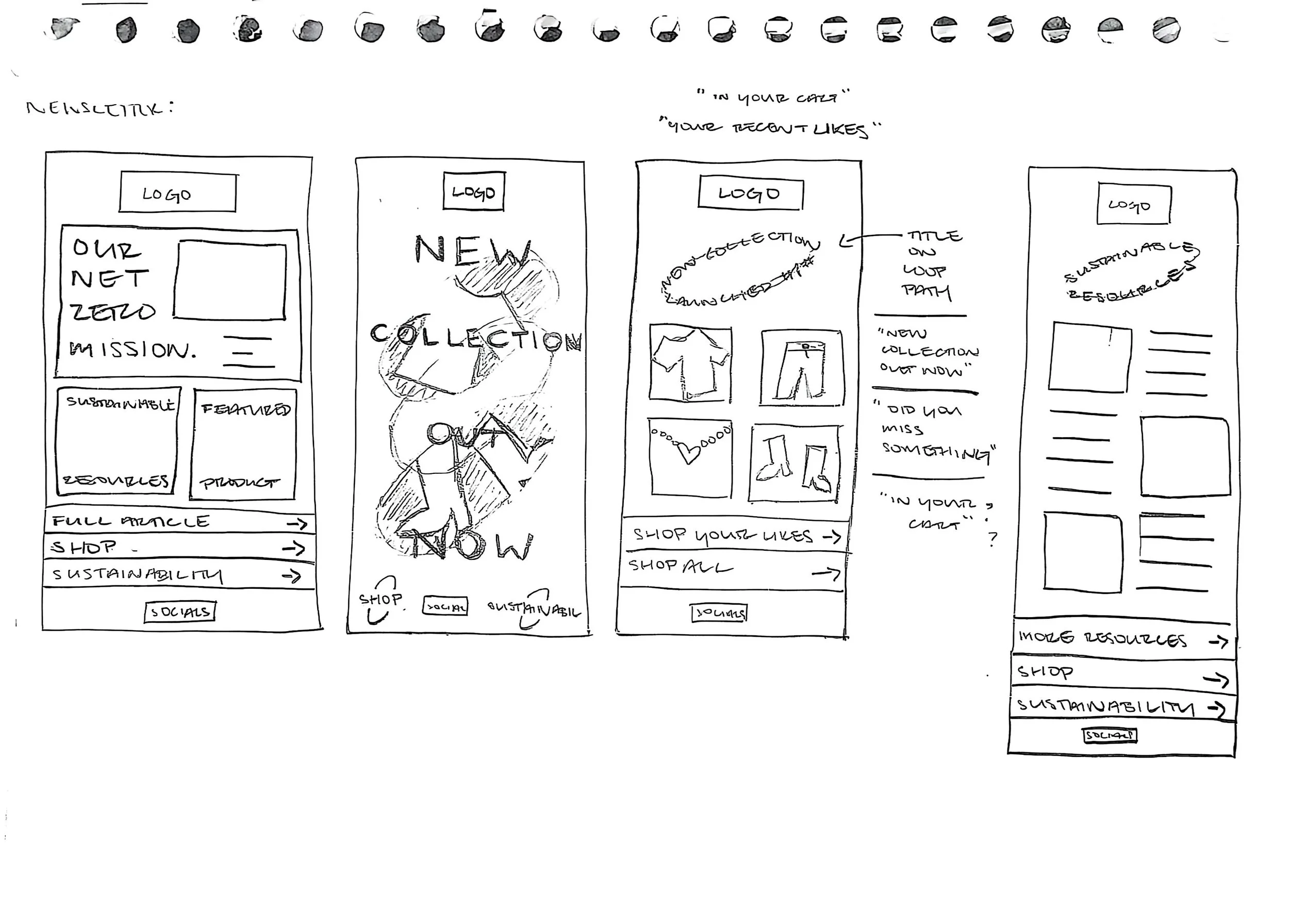
GRID PLANNING
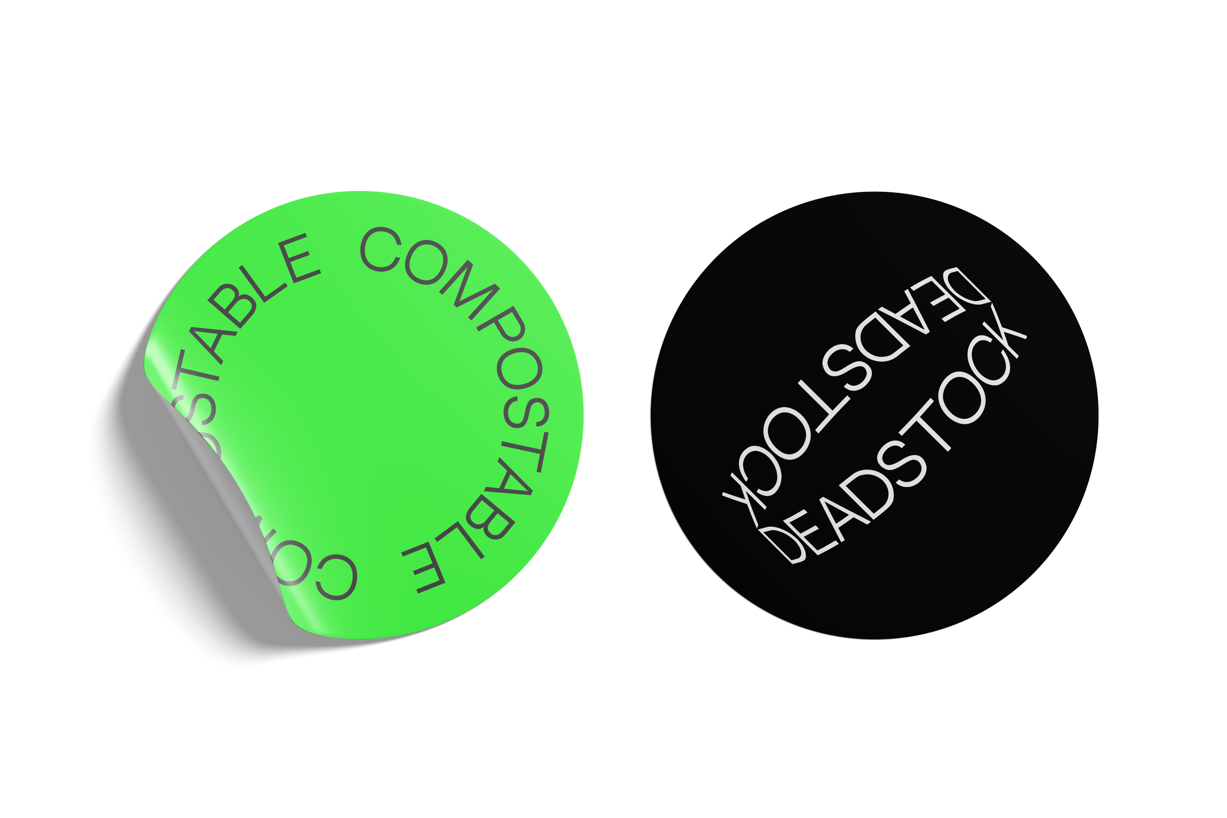
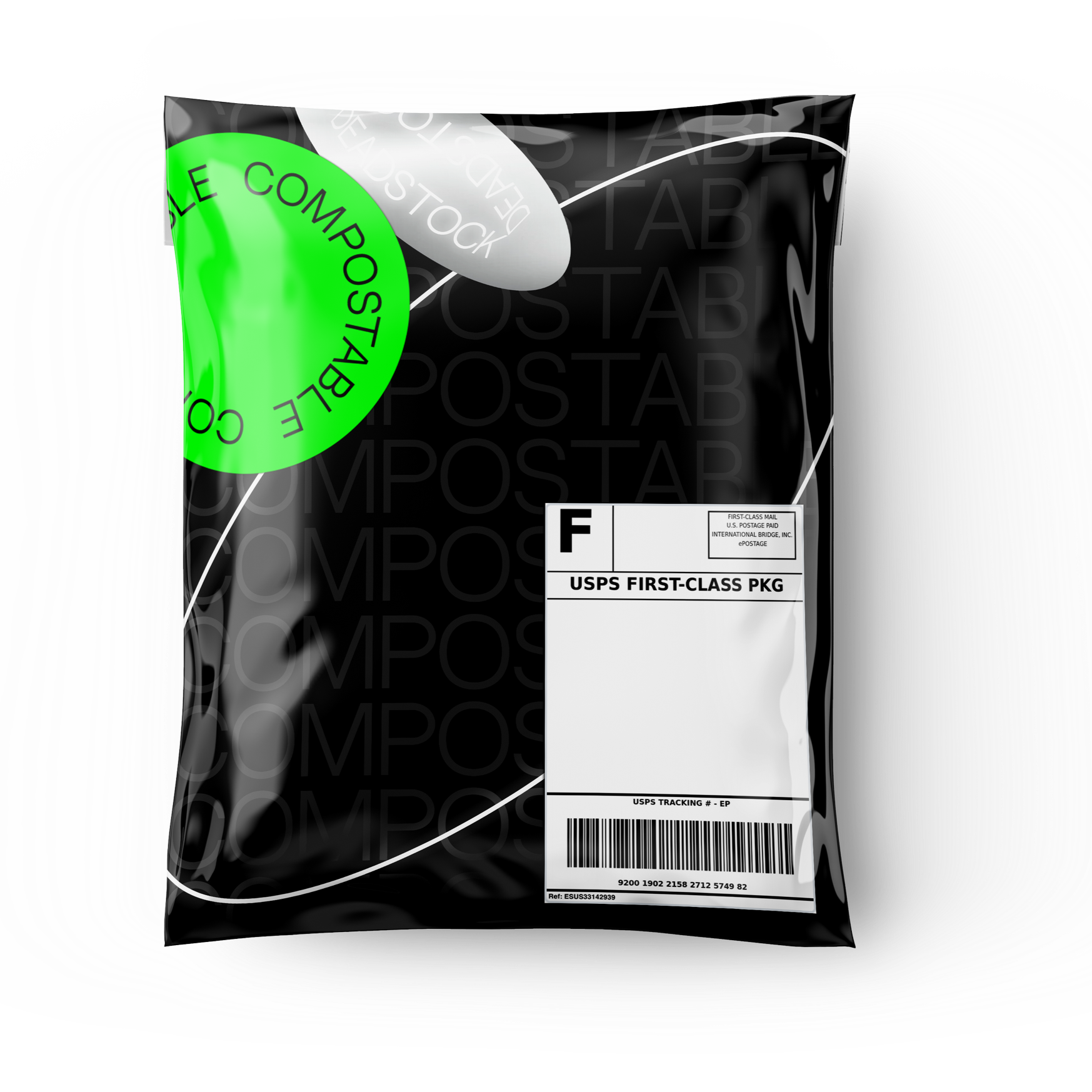
OUTCOME: The resulting identity positions Deadstock as a fashion-forward alternative to traditional resale and sustainability platforms. Across digital, packaging, social, and campaign applications, the system transforms circular consumption into a cohesive brand experience that feels contemporary, accessible, and desirable.
ECOPHORIA MUSIC FESTIVAL
BRAND IDENTITY / ART DIRECTION / TYPOGRAPHY / EVENT DESIGN
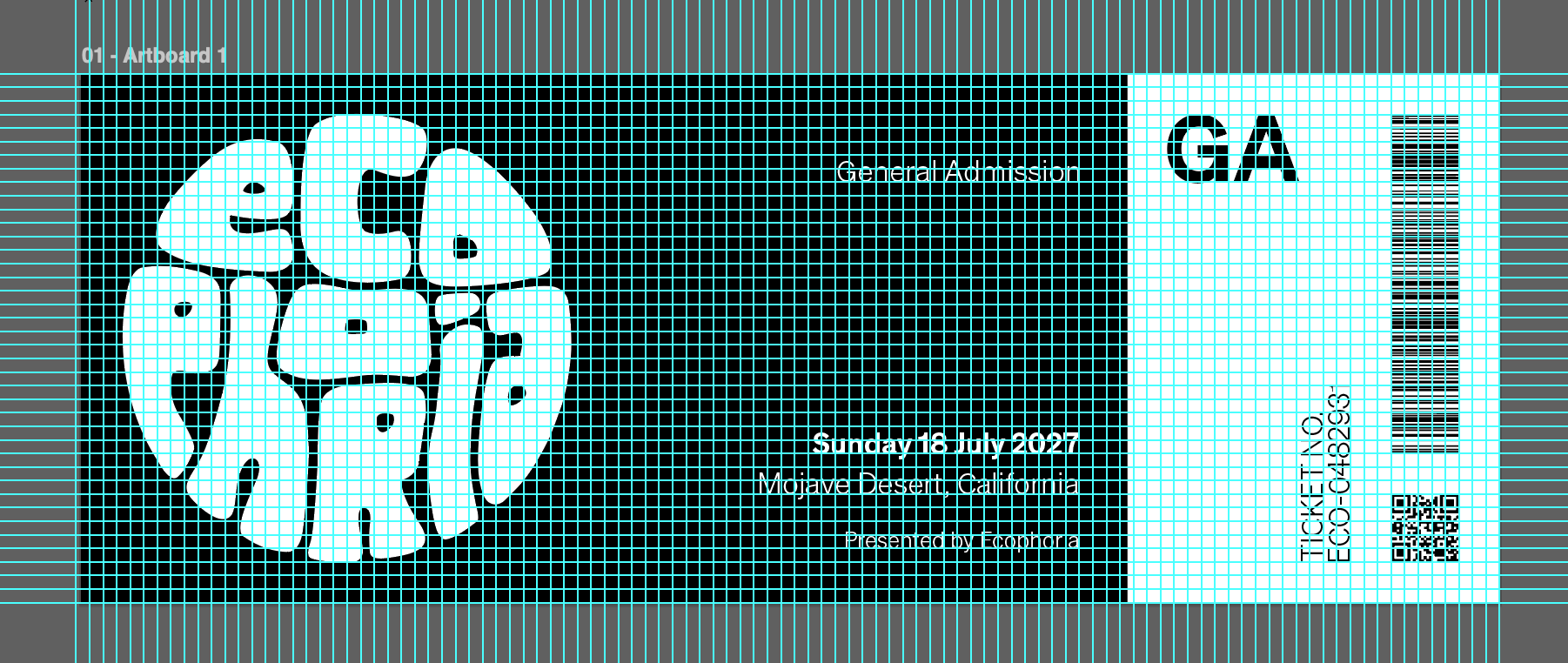
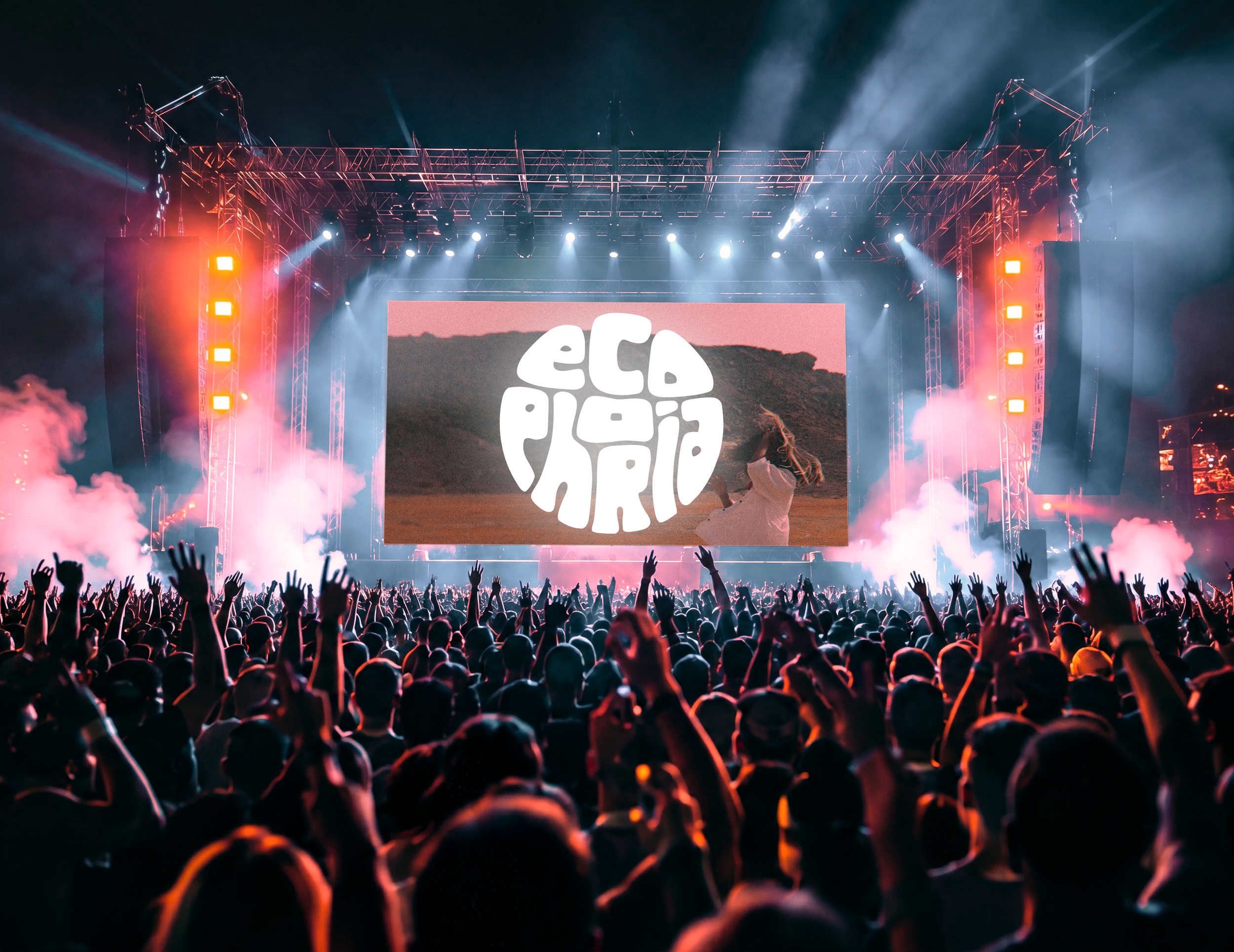
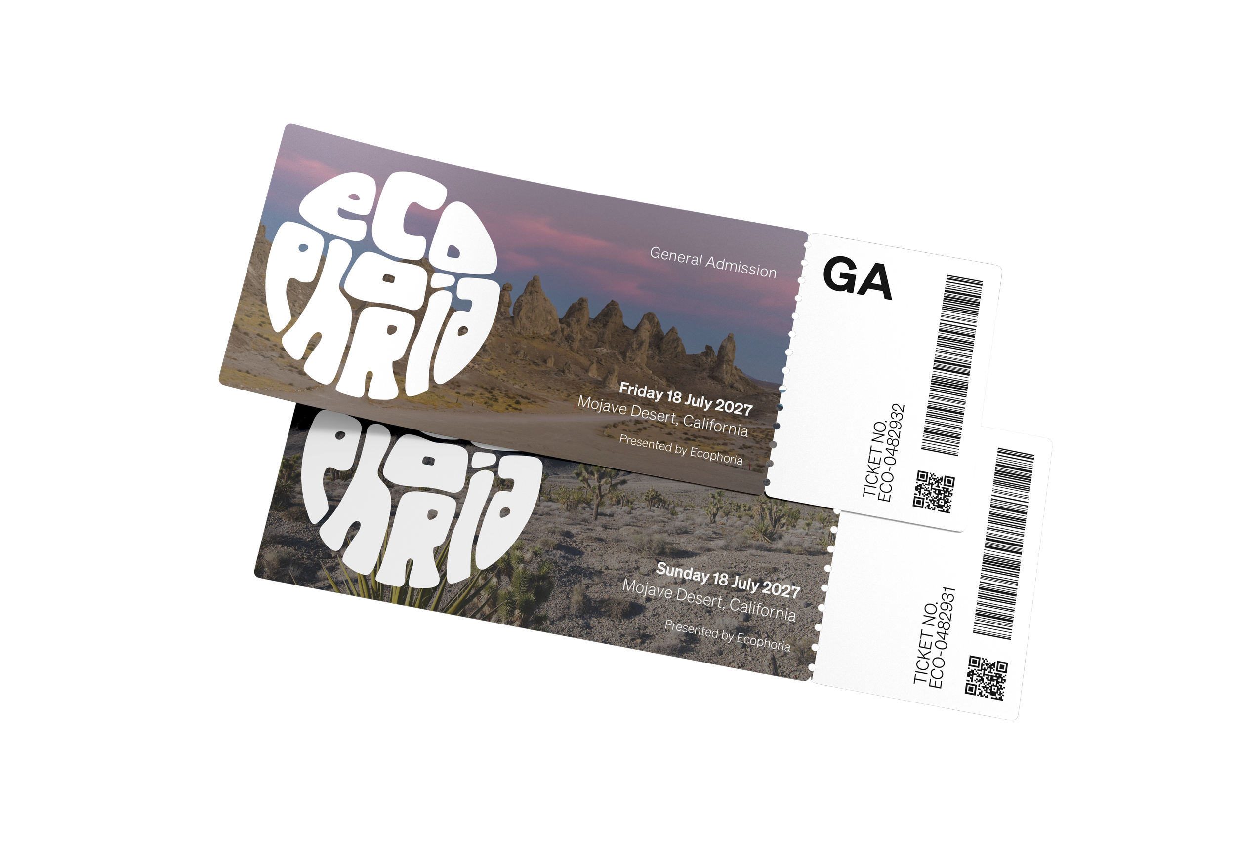
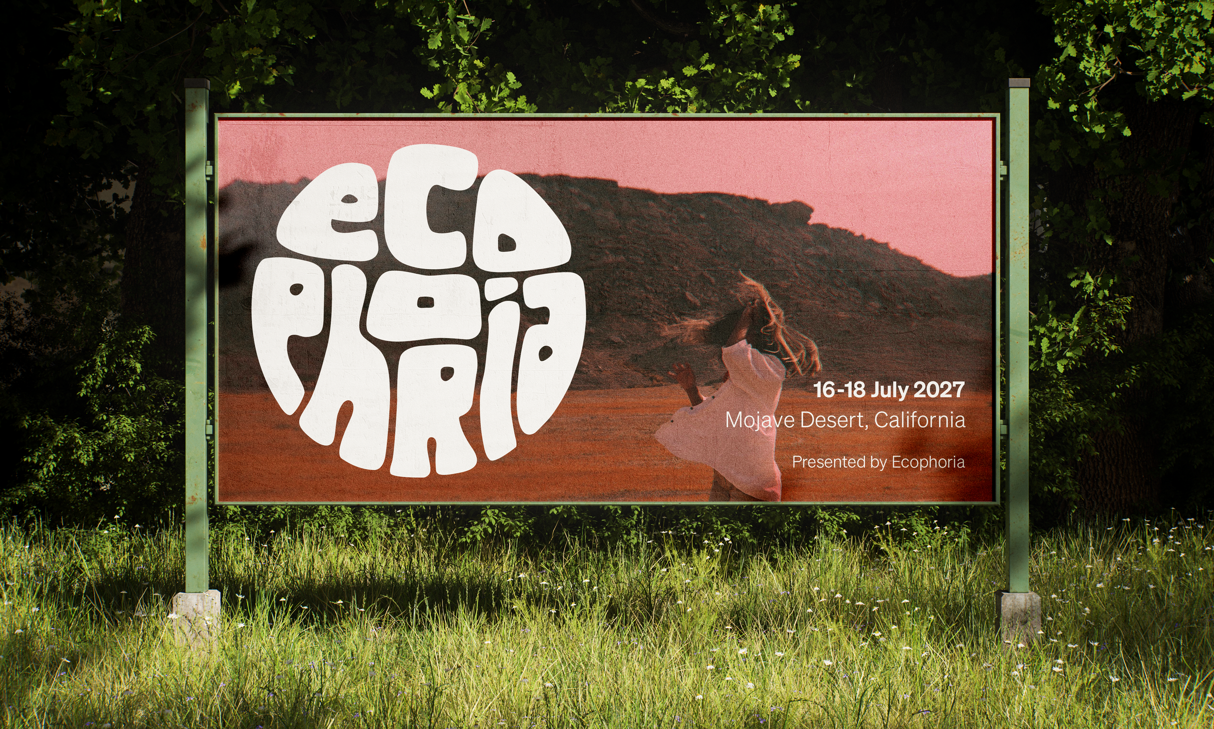
Ecophoria is a conceptual identity for a carbon neutral indie music festival held in California's Mojave Desert. Designed to raise awareness and funding for the preservation of natural vegetation and wildlife in the American Southwest, the project explores how environmental advocacy can be communicated through a bold, contemporary visual identity inspired by psychedelic counterculture.
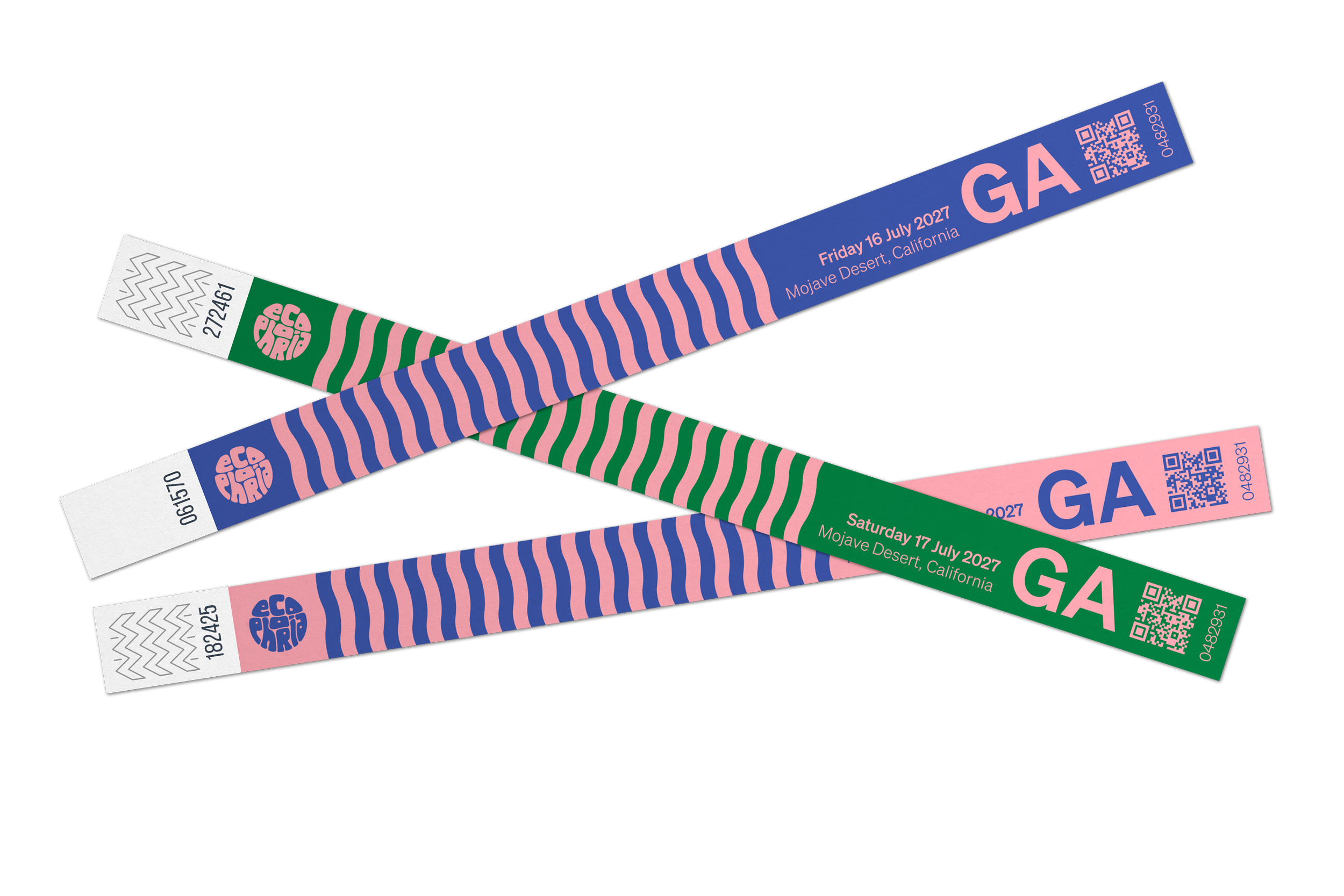
CHALLENGE: Ecophoria is a conceptual music festival celebrating sustainability, creativity, and community. The challenge was to create a visual identity that balanced environmental values with the vibrant energy of live music. The identity needed to feel immersive, expressive, and memorable across digital, print, and environmental applications.
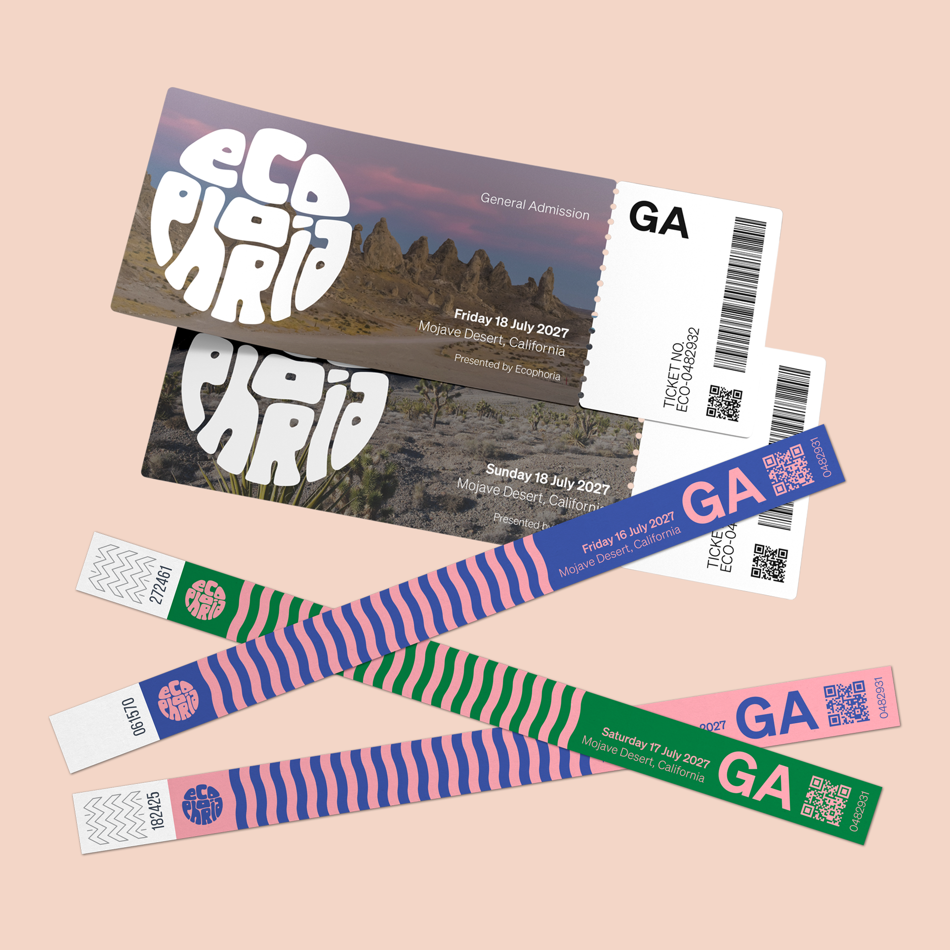
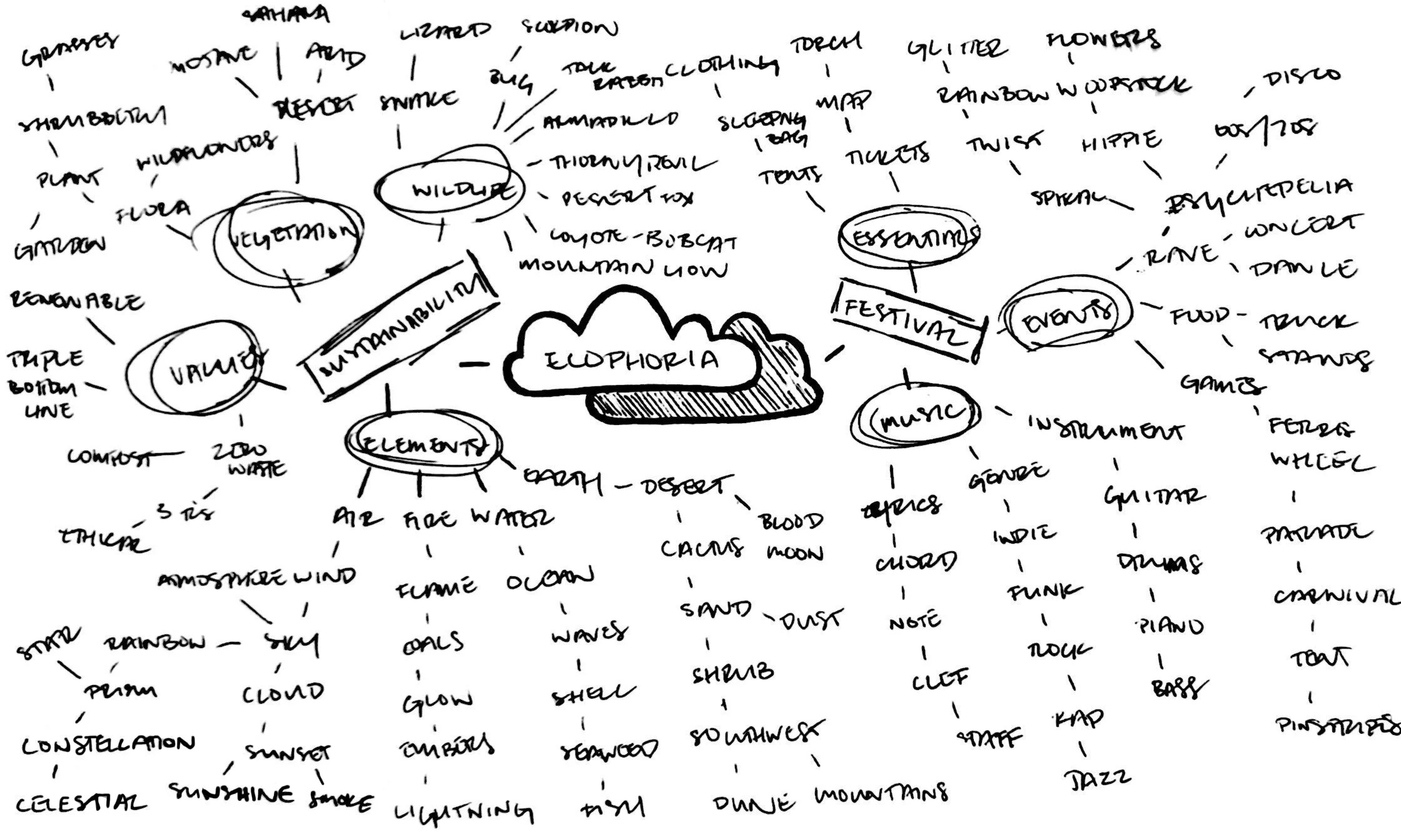
APPROACH: Research began with a mood board examining 1960s and 1970s psychedelic graphics, hippie counterculture, and the visual landscape of the American Southwest. Rather than recreating vintage aesthetics, the project reinterprets these references through a modern lens using bold typography, saturated color, and simplified geometric forms. A radial mind map and iterative thumbnail sketches helped establish recurring visual motifs including the Earth, rainbows, and organic cloud-like forms. These explorations informed a flexible visual language that feels expressive, approachable, and unmistakably festival-oriented.
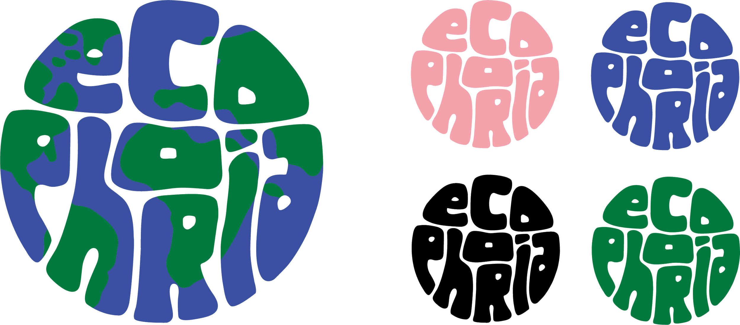
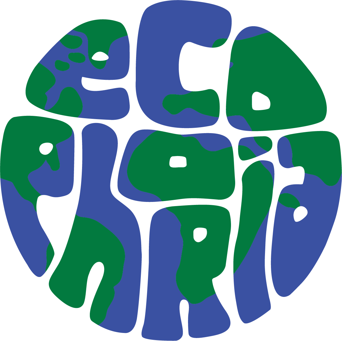
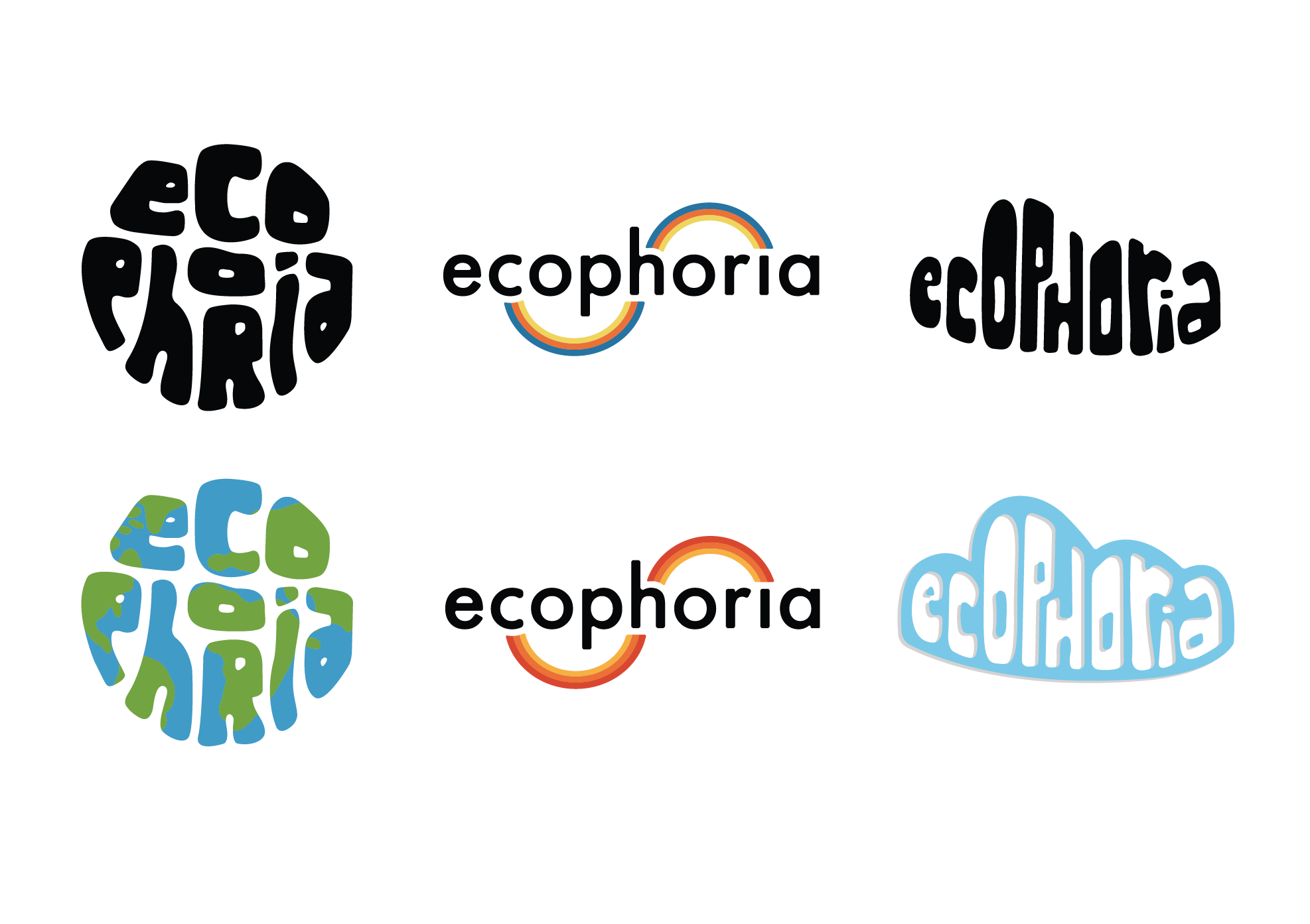
The final logo combines custom hand-drawn letterforms into the silhouette of a globe, reinforcing the festival's environmental mission while creating an instantly recognizable symbol. The mark was designed to remain legible at a variety of scales and across both monochrome and full-color applications.
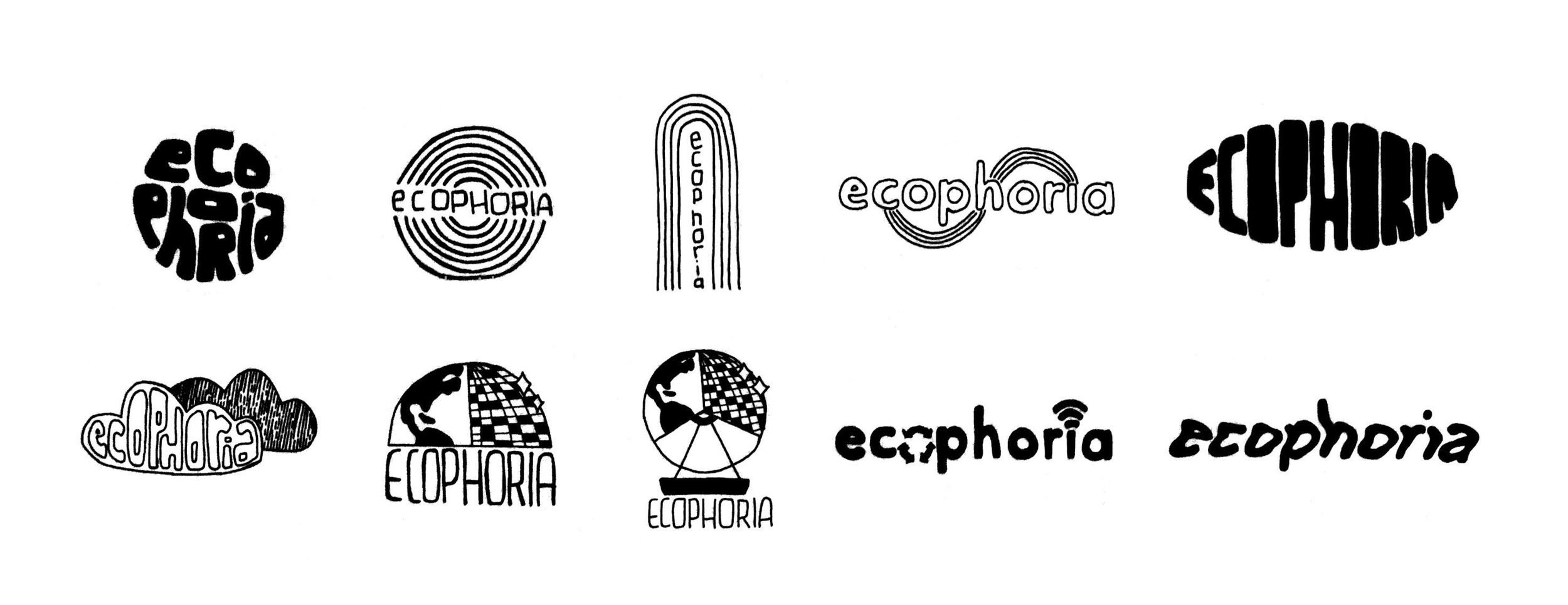
THUMBNAIL SKETCHES
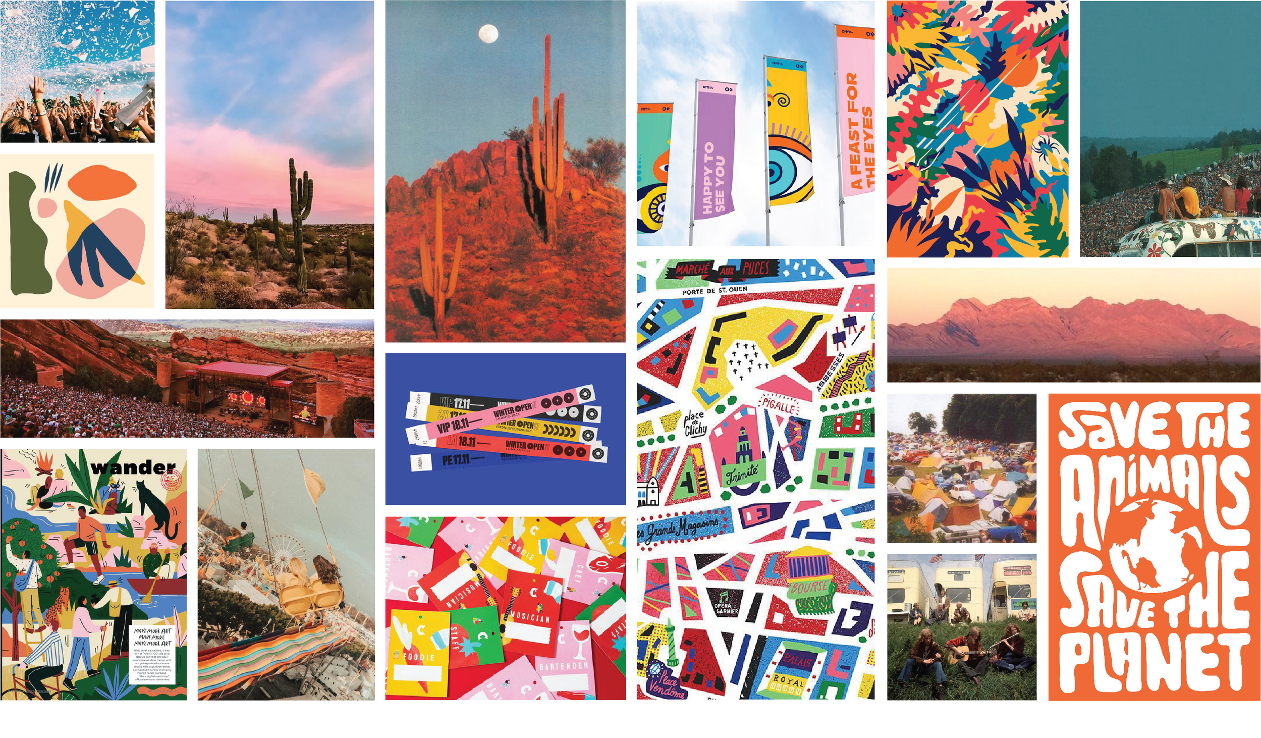
REFINED THUMBNAIL SKETCHES


LOGO REFINEMENT + EARLY COLOR PALETTE EXPERIMENTATION
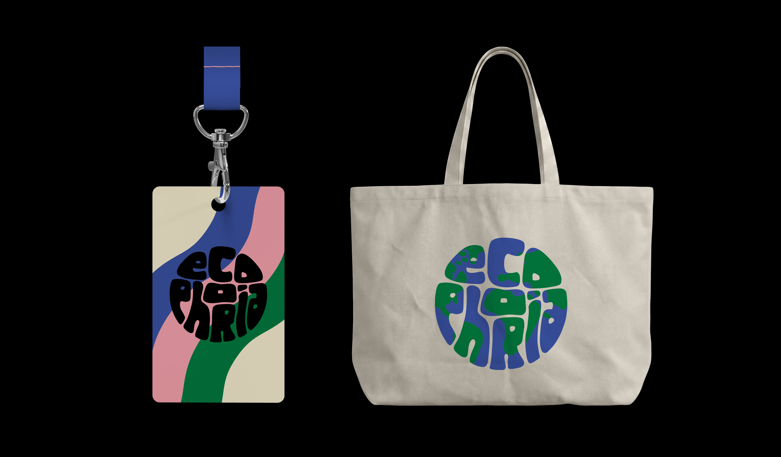
OUTCOME: The resulting identity captures the energy of a contemporary music festival through an expressive visual system inspired by nature, movement, and community. Flexible branding elements, bold typography, and immersive graphics create a memorable experience that extends seamlessly across environmental graphics, merchandise, and promotional materials.